私が遭遇した、ビューポート制御ライブラリ「monaca.viewport.js」を使用したときの不思議な現象について記してみたいと思います。
monaca.viewport.js
このライブラリは、モバイル端末の解像度の違いを吸収してくれる便利なライブラリです。具体的には、端末の表示領域(window.innerWidth)にぴったり合うようにアプリのコンテンツ(body要素)を拡大縮小します。また、resizeイベントを監視して端末の回転を検知し拡大縮小します。
詳細については以下のサイトをご参照ください。
現象
monaca.viewport.jsを使用するとき、body要素のwidthプロパティに値を設定すると、端末の向きを縦から横に回転させ、縦に戻したときに、window.innerWidth/innerHeightやdocument.body.clientWidth/clientHeightの値がもとに戻らなくなりました。例えば、「ライブラリでビューポート(表示領域)を360pxに設定したから、bodyのサイズも360pxに設定しとこう」と考えてbody要素のwidthプロパティに値を設定してしまうと、端末を回転させたときに画面のレイアウトが崩れることになるかもしれません。実際に私が作成したアプリでは、画面の回転の発生後に縦向きに戻ったとき、表示領域の高さが短くなり、リスト要素やボタンが途中で切れて隠れてしまいました。(表示されている部分をスワイプするとスクロールでき、リストの続きやボタンがでてきました)
検証
以下に検証用のソースコードを示します。使用する端末はAndroid 4.4.2で、apkファイルを構築し端末にインストールして確認します。テストは、端末を縦向きの状態で検証アプリを起動し、横向きにしてから縦向きに戻す、というもので、向きを変えたときに発生するresizeイベントのハンドラ内でwindow.innerWidth/innerHeightとdocument.body.clientWidth/clientHeightの値を出力して確認します。
index.html
ライブラリはデバッグ用のコードを追記して使用するため手動で読み込んでいます。コメント部分を有効/無効に切り替えてそれぞれテストを行います。
<!DOCTYPE HTML>
<html>
<head>
    <meta charset="utf-8">
    <meta name="viewport" content="width=device-width, initial-scale=1, maximum-scale=1, user-scalable=no">
    <meta http-equiv="Content-Security-Policy" content="default-src * data:; style-src * 'unsafe-inline'; script-src * 'unsafe-inline' 'unsafe-eval'">
    <script src="components/loader.js"></script>
    <script src="lib/onsenui/js/onsenui.min.js"></script>
    <script src="monaca.viewport.js"></script>
    <link rel="stylesheet" href="components/loader.css">
    <link rel="stylesheet" href="lib/onsenui/css/onsenui.css">
    <link rel="stylesheet" href="lib/onsenui/css/onsen-css-components.css">
    <link rel="stylesheet" href="css/style.css">

    <style>
        body {
            margin: 0;
            padding: 0;
            background-color: blue;
/*
            width: 360px;
*/
        }
        #results li {font-size: 10px;}
        #results li.title {color: red;}
        #results li.desc {color: white;}
    </style>

    <script>
        ons.ready(function() {
            assert("ons.ready", true);
            assert("innerWidth: " + window.innerWidth);
            assert("innerHeight: " + window.innerHeight);
            assert("clientWidth: " + window.document.body.clientWidth);
            assert("clientHeight: " + window.document.body.clientHeight);
        });

        // ビューポート設定
        monaca.viewport({
        	width : 360,
        	onAdjustment : function(scale) {
                assert("onAdjustment", true);
                assert("zoom: " + scale);
        	}
        });

        function assert(desc, title) {
            var li = document.createElement("li");
            li.className = title ? "title" : "desc";
            li.appendChild(document.createTextNode(desc));
            document.getElementById("results").appendChild(li);
        }
    </script>
</head>
<body>
    <ul id="results"></ul>
</body>
</html>
monaca.viewport.js
ハイライト部分に手を加えました。
/*
 *  monaca.viewport.js
 *
 *  Copyright (c) 2012 Asial Corporation<info@asial.co.jp>
 *
 *  Permission is hereby granted, free of charge, to any person obtaining a copy
 *  of this software and associated documentation files (the "Software"), to deal in
 *  the Software without restriction, including without limitation the rights to
 *  use, copy, modify, merge, publish, distribute, sublicense, and/or sell copies
 *  of the Software, and to permit persons to whom the Software is furnished to do
 *  so, subject to the following conditions:
 *
 *  The above copyright notice and this permission notice shall be included in all
 *  copies or substantial portions of the Software.
 *
 *  THE SOFTWARE IS PROVIDED "AS IS", WITHOUT WARRANTY OF ANY KIND, EXPRESS OR
 *  IMPLIED, INCLUDING BUT NOT LIMITED TO THE WARRANTIES OF MERCHANTABILITY, FITNESS
 *  FOR A PARTICULAR PURPOSE AND NONINFRINGEMENT. IN NO EVENT SHALL THE AUTHORS OR
 *  COPYRIGHT HOLDERS BE LIABLE FOR ANY CLAIM, DAMAGES OR OTHER LIABILITY, WHETHER
 *  IN AN ACTION OF CONTRACT, TORT OR OTHERWISE, ARISING FROM, OUT OF OR IN CONNECTION
 *  WITH THE SOFTWARE OR THE USE OR OTHER DEALINGS IN THE SOFTWARE.
 */

(function() {
    window.monaca = window.monaca || {};

    var IS_DEV = false;
    var d = IS_DEV ? alert : function(line) { console.debug(line); };

    /**
     * Check User-Agent
     */
    var isAndroid = !!(navigator.userAgent.match(/Android/i));
    var isIOS     = !!(navigator.userAgent.match(/iPhone|iPad|iPod/i));

    var defaultParams = {
        width : 640,
        onAdjustment : function(scale) { }
    };

    var merge = function(base, right) {
        var result = {};
        for (var key in base) {
            result[key] = base[key];
            if (key in right) {
                result[key] = right[key];
            }
        }
        return result;
    };

    var zoom = function(ratio) {
        if (document.body) {
            if ("OTransform" in document.body.style) {
                document.body.style.OTransform = "scale(" + ratio + ")";
                document.body.style.OTransformOrigin = "top left";
                document.body.style.width = Math.round(window.innerWidth / ratio) + "px";
            } else if ("MozTransform" in document.body.style) {
                document.body.style.MozTransform = "scale(" + ratio + ")";
                document.body.style.MozTransformOrigin = "top left";
                document.body.style.width = Math.round(window.innerWidth / ratio) + "px";
            } else {
                document.body.style.zoom = ratio;
            }
        }
    };

    if (isIOS) {
        monaca.viewport = function(params) {
            d("iOS is detected");
            params = merge(defaultParams, params);
            document.write('<meta name="viewport" content="width=' + params.width + ',user-scalable=no" />');
            monaca.viewport.adjust = function() {};
        };
    } else if (isAndroid) {
        monaca.viewport = function(params) {
            d("Android is detected");
            params = merge(defaultParams, params);

            document.write('<meta name="viewport" content="width=device-width,target-densitydpi=device-dpi" />');

            monaca.viewport.adjust = function() {
                var scale = window.innerWidth / params.width;
                monaca.viewport.scale = scale;
                zoom(scale);
                params.onAdjustment(scale);
            };

            var orientationChanged = (function() {
                var wasPortrait = window.innerWidth < window.innerHeight;
                return function() {
                    var isPortrait = window.innerWidth < window.innerHeight;
                    var result = isPortrait != wasPortrait;
                    wasPortrait = isPortrait;
                    return result;
                };
            })();

            var aspectRatioChanged = (function() {
                var oldAspect = window.innerWidth / window.innerHeight;
                return function() {
                    var aspect = window.innerWidth / window.innerHeight;
                    var changed = Math.abs(aspect - oldAspect) > 0.0001;
                    oldAspect = aspect;

                    d("aspect ratio changed");
                    return changed;
                };
            })();       // ()付け足し

            if (params.width !== 'device-width') {
                window.addEventListener("resize", function() {
                    assert("resize", true);
                    assert("innerWidth: " + window.innerWidth);
                    assert("innerHeight: " + window.innerHeight);
                    assert("clientWidth: " + window.document.body.clientWidth);
                    assert("clientHeight: " + window.document.body.clientHeight);

                    var left = orientationChanged();
                    var right = aspectRatioChanged();

                    if (left || right) {
                        monaca.viewport.adjust();
                    }
                }, false);
                document.addEventListener('DOMContentLoaded', function() {
                    assert("DOMContentLoaded", true);
                    assert("innerWidth: " + window.innerWidth);
                    assert("innerHeight: " + window.innerHeight);
                    assert("clientWidth: " + window.document.body.clientWidth);
                    assert("clientHeight: " + window.document.body.clientHeight);

                    monaca.viewport.adjust();
                });
            }
        };
    } else {
        monaca.viewport = function(params) {
            params = merge(defaultParams, params);
            d("PC browser is detected");

            monaca.viewport.adjust = function() {
                var width = window.innerWidth || document.body.clientWidth || document.documentElement.clientWidth;
                var scale = width / params.width;
                zoom(width / params.width);
                params.onAdjustment(scale);
            };

            if (params.width !== 'device-width') {
                window.addEventListener("resize", function() {
                    monaca.viewport.adjust();
                }, false);
                document.addEventListener("DOMContentLoaded", function() {
                    monaca.viewport.adjust();
                });
            }
        };
    }

    monaca.viewport.isAndroid = isAndroid;
    monaca.viewport.isIOS     = isIOS;
    monaca.viewport.adjust    = function() { };
})();
body要素にwidthプロパティを指定しない場合
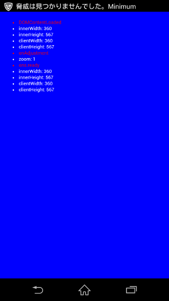
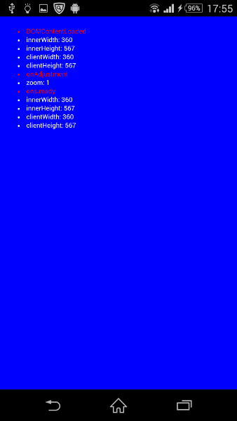
1.アプリ起動時
私の端末は 360 x 567 です。
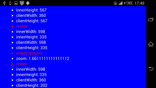
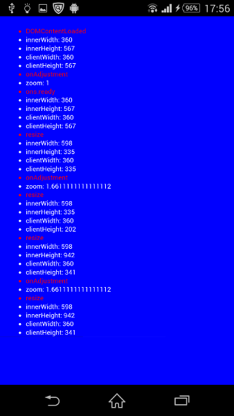
2.横向き
端末を横にすると、resizeハンドラ内で 598 x 335 と表示されました。ライブラリでは、598 / 360 = 1.6611… ということで、body要素のzoomプロパティにこの値を設定し、コンテンツが拡大されます。実際、縦向きのときと文字の大きさを比べてみると拡大されているのが分かります。(ライブラリを使わない場合は縦向きのときと同じ大きさになります)
最終行のresizeハンドラ内でclientWidth/clientHeightが 360 x 202 になっています。これは正直わかりませんが、zoomプロパティに1.6611…を設定した後に発生したresizeイベントのハンドラ内ですでにclientWidth/clientHeightの値がどちらも 0.6020倍(= 360 / 598)縮小された(幅に合わせて縮小された?)状態になっている、という見方もできそうです。
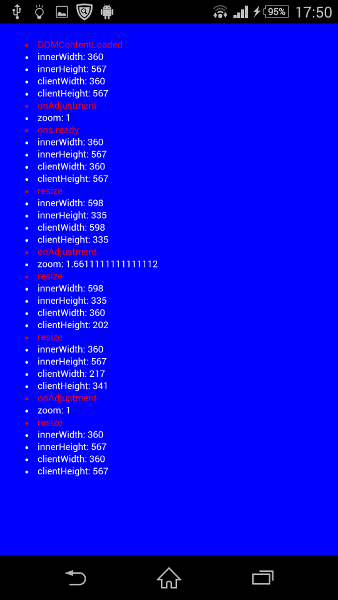
3.縦に戻す
最後に端末を縦に戻すと、resizeハンドラ内ですでにinnerのサイズが 360 x 567 に戻っています。clientのサイズは 217 x 341 になりました。次にzoomプロパティの値を1.66111…から 1 に書き換えると、resizeハンドラ内でclientのサイズが 360 x 567 に戻ったことが確認できます。
body要素にwidthプロパティを指定した場合
上記index.htmlの20-22行目のコメントをとった状態(width: 360pxを設定した状態)で実行してみます。
1.アプリ起動時
widthプロパティ指定なしと同じ状態です。
2.横向き
ここでもwidthプロパティ指定なしと同じ状態です。

3.縦に戻す
ここが問題の箇所になります。端末の向きを縦にしたことで発生するresizeイベントのハンドラ内で、innerのサイズが 598 x 942 と、もとに戻らないのです。このため、zoomの値は 360 / 360 = 1 ではなく、598 / 360 = 1.6611…となります。最終的に、innerのサイズとclientのサイズがもとのサイズに戻らないということになります。(ちなみに私のアプリでは、clientHeightの値である341pxで表示が切れてしまいました)
まとめ
monaca.viewport.jsを使用する場合、body要素のwidthプロパティに値を設定すると、端末を回転させたとき、innerのサイズやclientのサイズが想定外の値になるので、widthの指定はやめたほうがいいかと思います(ちなみに「width: 100%;」の指定なら問題ないみたいです)。
「端末を回転させなければ問題ない」とは思いますが、この場合も注意したほうがいいケースがあります。それはインタースティシャル広告を使用している場合です。横向きのインタースティシャル広告が表示されるとき、強制的に回転した状態になります。そもそもこの現象は、端末の「画面の自動回転」設定を無効にしている状態で、横向きのインタースティシャル広告が表示されたときに発覚しました。そのときはかなりの衝撃を受けました。「早急に対応しなくては」ということで、bodyのwidthを削除することなく(気づかず)、ライブラリをいじりました。ついでなので載せておきます。一応問題なく動いています。
monaca.viewport.adjust = function() {
    var params_width = params.width * parseFloat(document.body.style.zoom);
    var scale = window.innerWidth / params_width;
    monaca.viewport.scale = scale;
    zoom(scale);
    params.onAdjustment(scale);
};
document.addEventListener('DOMContentLoaded', function() {
    document.body.style.zoom = 1;
    monaca.viewport.adjust();
});
以上、ご参考まで。